
Shorefield is a British holiday parks and leisure company. The company’s art directors opened a re-branding contest. This is my submission.
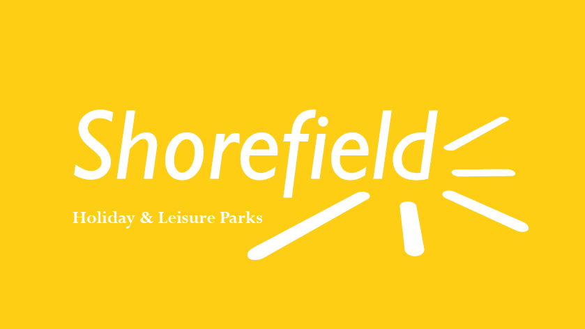
The symbol should be kept, for a better association with the company. I feel this same branding logic is applied to Shorefield and its sun symbol. The new masthead has not only that element, but also the freshness of the yellow and forwardness of the italic.
Furthermore, and equally important, the display typeface is a local and British one – Gill Sans – accompanied by its sister Perpetua for body text. These two typefaces form a pair due their similarity, keeping the same local idea, yet Perpetua being a hint of luxury.


Shorefield stationary

Easy out-of-the-wallet fold

Shorefield Camps brochure

Poster mockup

Website mockup