Friends back home kept asking “Zé, you never post anything online. What have you been doing? How are we supposed to know?”
Category: Project Direction
-

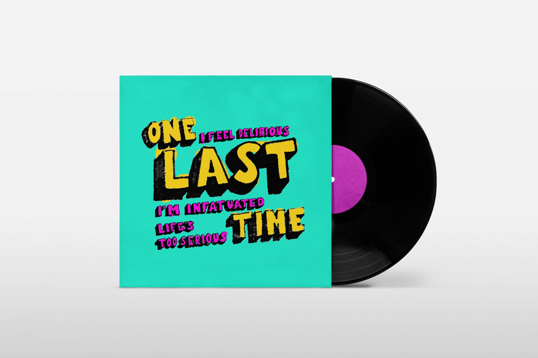
One Last Time: Single Cover
Brief
Commissioned illustration to design the face of Tom Pointer’s new single One Last Time, to be used when releasing it on online streaming platforms. Tom was inspired by typographic urban art he’d seen on his journey to the USA and this design absolutely had to be of a typographical nature.
Goals & Unique Solution
Artwork to portray the song’s playfulness and determination. Strong on storytelling, the client insisted on a typographic approach. The colours were chosen to ‘pack a punch’.
Below, you can see the main steps of the ideation process presented to the client. I structured a process that included the client’s feedback in each stage, where we agreed on a couple of designs, typography, layout and colours. We reached the final artwork together. -

byAGIL branding
Brief
byAGIL is both an architecture and artistic atelier, that focuses on tile panel design. I have yet to find anyone more passionate
about modules and patterns than this client.
Branding requirements for this studio’s image were:
. Being square, like tiles;
. Two logos: one to reflect the architecture and, another
for the artistic side of what the studio does. They would
be presented on different occasions and contexts.
