Currently at Product Designer at Societe Generale Corporate and Investment Banking – SGCIB, optimising user experiences for financial products and collaborating with amazing people.
Category: Projects
-
This is a Design post
Text on a post
-
Creating an illustration system

Outline illustration
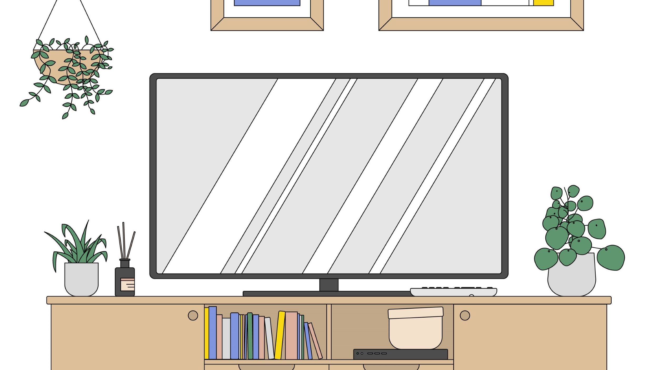
I’ve developed an illustrated set of several components, all designed to fit together in the same ecosystem – keeping the outlined graphic style.
Why do you care? Because this makes sure that there is a consistent style throughout the whole illustration system, while providing some ease to present regular new illustrations – essential when tailoring to new briefs.


Home elements – Can you find them in the next illustrations? These elements can be applied in several illustrations, such as a working from home scenario, a living room, a kitchen, etc.
At the same time, we can easily fit an image to a new brief with several variations in colour and elements. See if you can spot the differences in the following:
Have you noticed a focus in a reduced colour palette? We want it to be as easy as possible for our clients:
- To mentally apply the image to their needs.
- And to be able to add their own dash of personality on top – for some easily endless customisation.
Don’t worry, I keep my SVG files and keywords tidier than these toiletries placed all around:


Are you ready to partner up? Don’t hesitate to drop me a line at hello@zemonteiro.com
-
CHIMPAN zine
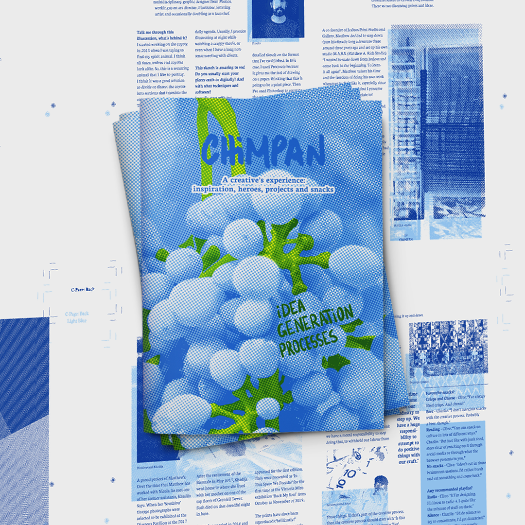
Friends back home kept asking “Zé, you never post anything online. What have you been doing? How are we supposed to know?”
-
Bastard Crisis Exhibition
Brief
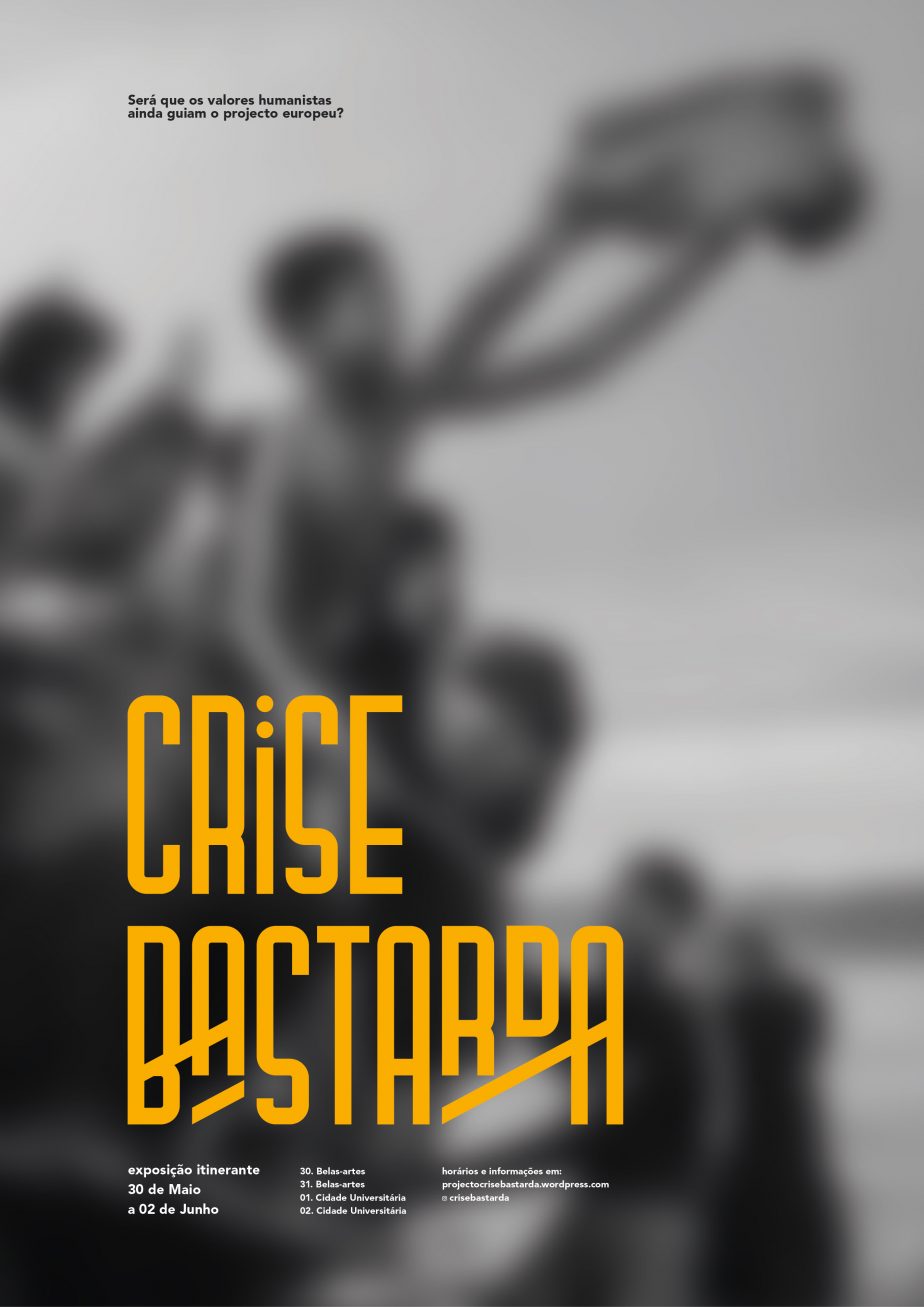
Are the values in The Charter of Fundamental Rights of the European Union still leading the European Project? In a Europe that is trying to compete in the capitalist market economy – yet still confronting political and humanitarian crises – shines the importance of raising awareness of the outshined values.
This was a university group project, and the images reflect my contribution to it. -
One Last Time: Single Cover
Brief
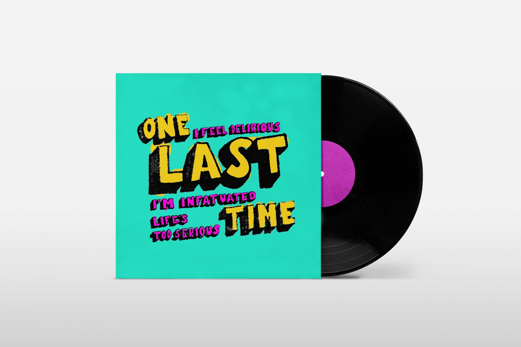
Commissioned illustration to design the face of Tom Pointer’s new single One Last Time, to be used when releasing it on online streaming platforms. Tom was inspired by typographic urban art he’d seen on his journey to the USA and this design absolutely had to be of a typographical nature.
Goals & Unique Solution
Artwork to portray the song’s playfulness and determination. Strong on storytelling, the client insisted on a typographic approach. The colours were chosen to ‘pack a punch’.
Below, you can see the main steps of the ideation process presented to the client. I structured a process that included the client’s feedback in each stage, where we agreed on a couple of designs, typography, layout and colours. We reached the final artwork together. -
byAGIL branding
Brief
byAGIL is both an architecture and artistic atelier, that focuses on tile panel design. I have yet to find anyone more passionate
about modules and patterns than this client.
Branding requirements for this studio’s image were:
. Being square, like tiles;
. Two logos: one to reflect the architecture and, another
for the artistic side of what the studio does. They would
be presented on different occasions and contexts. -

In-house information design & illustration: Mintel
Brief
Working in a market trends agency, my role is to transform an analytic overview of the market into compelling, visual and informative designs on a daily basis. These data-sets are designed to be easily consumed and digested, mostly for clients’ internal presentations.

This project involves:
. Information design;
. Illustration;
. Visual storytelling;
. Concept design;
. Data visualisation DataWorkflow
Working in-house, I design the data-sets following the company’s visual guidelines, adding some personal flair. As per the usual workflow, a data-set is expected to be designed within 1:30-2 hours. Furthermore, part of the visual guidelines foresees the data-points’ colours as the following:


-
What is Screen Printing? And why should you get on board with it
Most visual creatives thrive for immediate results in their work. You work on what you see and you see what you are working on. It is not about speed, it’s about the constant sensorial stimulus of a project and the effort that is behind it all.
When talking to several artists, the most common answer to “why do you enjoy screen printing?” is that they feel like they can produce something themselves. It’s all about taking matters into your own hands.
Isn’t that the pure essence of freelancing?
Screen what?
You might have heard of “Screen printing” or “Silkscreen printing”, perhaps even the uncommon “serigraphy” followed by artists’ names like Andy Warhol or Roy Lichtenstein, but what is it exactly?
Wikipedia says it is “not to be confused with print screen”. A common mix-up and nothing to do with this. Screen Printing is a stencil-based printmaking technique primarily focused on batch reproduction of a design.
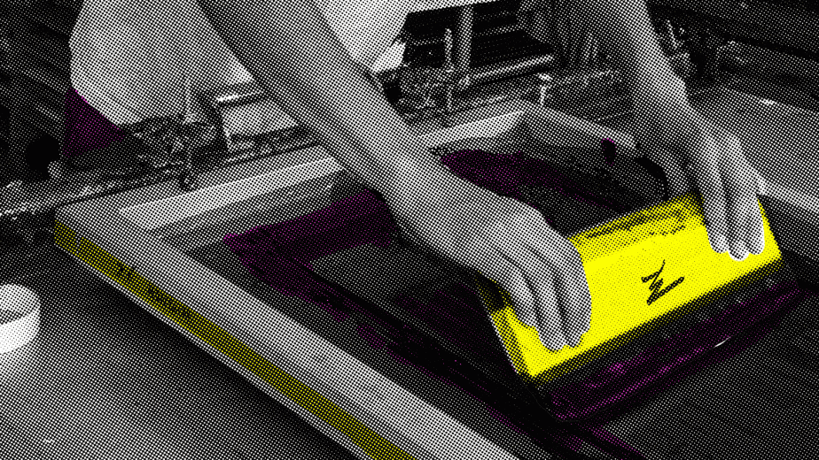
First, you manually push ink through a mesh that is holding a design and onto a substrate, usually paper or t-shirts.

Simply put, you pass ink through a stencil and onto paper, or whatever surface you want.

Your design is broken down into a layer per colour and made into stencils in a framed mesh, what we call a screen. It is easy to picture the screen as a flat sieve, where you block the net where you don’t want the ink to flow down.

By doing so, you have just made a stencil! Each screen will generally correspond to a colour, having one screen for a one-colour design or two screens for a two-colour design, and so on.

Let’s say your poster is made with only blue and black tones. Then you would separate the two, putting all the blues in one screen and all the blacks in the other. All your posters would be printed in a blue layer first, followed by a black layer afterwards.

Seem complicated? It’s much simpler when you do it
With this complex process comes the feeling that you can do it! You quickly start demystifying the technique and realise you can make your own indie band’s merchandising, or your own line of notebooks, and perhaps even flyers for your event.
That’s exactly how I got into screen printing. Suddenly, I could apply my graphic skills into something I could control, see and feel. I had found a way to combine design with a hands-on craft that would get me all inked up. Once I got the gist of the technique, I then started to explore with it, printing onto anything I could get my hands on (bioplastics and tiles were a real challenge). Six years down the line and I still have much to try.
I have now set up a screen-printing business. Alternating between my own work, print commissions and a new and crazy experience here and there. I take the opportunity to spread my art as far as I can and meet some interesting people as well. What better way to relate to other designers, illustrators and artists than to share a print?
Get on board with it
Following Andy Warhol’s footsteps, many other artists have taken production into their own hands. Printing in multiples enables you to meet the buyer half-way, allowing your art to reach more people and thus sell for a cheaper price.
Whether you print it yourself or commission a screen print, manual craft always adds an extra value to a product of an artistic nature. Not only this, there are certain colours and techniques that are exclusive to screen printing. How many times have you struggled to get that punchy colour that you see in an RGB (Red, Green, Blue, the additive colour system that we see on screens) screen and it never comes out in the CMYK (Cyan, Magenta, Yellow, Black, the subtractive colour system that we see) inks combination? How would you get a metallic ink into your print otherwise? Screen printing is your most accessible solution. Not to mention a lot of fun.
Should you start screen printing your own designs, I would say the most cliché tips apply. First of all, experiment. Secondly, have fun doing so, otherwise what’s the point? Practice, practice, practice is my advice. You are bound to find some technical hurdles. I have been lucky enough to find a studio where I can ask anything to my peers, and that has propelled my technique and career forward. My last tip would be to do the same. You will find yourself giving tips to new printmakers in no time.


